


REVIEW :: SUPERMAG by JIM RUGG


![]() The most important aesthetic breakthrough in comics in the 21st century is the increased attention (by both artists and critics) to the picture plane, the exploration of comics as a rapturous visual experience as well as a vehicle for narrative. The book most responsible for this shift is the anthology Kramers Ergot #4 (2003), which juxtaposed the deliberately crude, resolutely non-narrative aesthetics of Fort Thunder cartoonists like Mat Brinkman and Leif Goldberg with such story-based work as Jeffrey Brown’s autobio strips, Sammy Harkham’s Poor Sailor, and early excerpts from Frank M. Young and David Lasky’s Carter Family graphic novel. This mix of approaches made reading Kramers #4 a disorienting experience, a book that, in critic Bill Kartalopoulos’ words,
The most important aesthetic breakthrough in comics in the 21st century is the increased attention (by both artists and critics) to the picture plane, the exploration of comics as a rapturous visual experience as well as a vehicle for narrative. The book most responsible for this shift is the anthology Kramers Ergot #4 (2003), which juxtaposed the deliberately crude, resolutely non-narrative aesthetics of Fort Thunder cartoonists like Mat Brinkman and Leif Goldberg with such story-based work as Jeffrey Brown’s autobio strips, Sammy Harkham’s Poor Sailor, and early excerpts from Frank M. Young and David Lasky’s Carter Family graphic novel. This mix of approaches made reading Kramers #4 a disorienting experience, a book that, in critic Bill Kartalopoulos’ words,
was clearly packed with a range of comics and art that included things I was comfortable with, things I was uncomfortable with, and things that I didn’t really know how to categorize. I bought it, without much equivocation. It seemed like I had to if I really wanted to know what was going on in comics.
Part of “what was going on” was a generation following Gary Panter’s example, dedicated to elaborate margins, psychedelic colors, ironic appropriations of mass cult logos and symbols, and mark-making independent of a line’s narrative function. It was suddenly OK to draw rough and be bold.
The Fort Thunder/Kramers paradigm shift has cross-pollinated comics culture in various ways. The newfound emphasis on design and decoration has snuck into some more mainstream direct-market books—I’m thinking of the Fort Thunder-meets-Heavy Metal success of Brandon Graham over at Image—even while Kramers #5 (2004) published my favorite narrative comic novella of the last decade, Kevin Huizenga’s “Jeepers Jacobs.” And then there’s Jim Rugg, an artist uncannily able to toggle between straight-forward storytelling and wild explorations of what Rugg himself, in the introduction to his new Supermag, calls “the narrative collapse.”
From the beginning of his career, Rugg could do meat-and-potatoes storytelling like a pro. In the five-issue mini-series Street Angel (2004-2005), Brian Maruca’s scripts call for a staggering variety of characters and locations (everything from grinding homelessness to the grand-guignol spectacle of a demonic ritual), and Rugg draws it all with confidence and grace. Rugg likewise captures a low-key cartoon naturalism in the two Young Adult graphic novels he did with writer Cecil Castellucci The Plain Janes (Minx/DC, 2007) and Janes in Love (Minx/DC, 2008).
It’s become clear, though, that Rugg also wants to play around, Kramers-like, with the materiality and graphic possibilities of the comics medium. I first noticed this tendency in the criminally underrated Cold Heat Special #4 (PictureBox, 2008), a collaboration credited to Frank Santoro (“story”) and Rugg (“story and art”). It’s a newspaper, a folded-over broadsheet, and it tells the tale of a girl (Castle, the central character of Santoro and Ben Jones’ original issues of Cold Heat) who gets a ride from a magical bird out of her gritty urban environment and into a milieu (a school protected by a woman with a shotgun) that evokes Charles Laughton’s remarkable film The Night of the Hunter (1955). When I talked to Rugg about Cold Heat Special #4 at Heroes Con 2008, he was justifiably very proud of the art, noting that working big allowed him to explore textures, patterns and compositions impossible in smaller-sized original art. Two examples:


Since the Cold Heat breakthrough, Rugg’s projects have become more narratively fragmented and visually adventurous. Afrodisiac (2009), Rugg and Maruca’s ambitious showcase for their Blaxploitation-inspired character from Street Angel, combines genre-blender stories with Rugg’s dead-on imitations of historical styles from superhero comics. (Even the covers Rugg draws for the Afrodisiac comic-within-a-comic are colored in faded hues, as if they’d been stashed away in Mylar snugs for too long.) In his mini-comic Rambo 3.5 (2010), he combines different art styles—a shaded, pseudo-Zipatoned “realism,” bigfoot cartooning, photos of G.I. Joe dolls, and even images appropriated from the Image Duplicator himself, Roy Lichtenstein—with a satiric script as eclectic as the pictures. And last year’s Notebook was a straight-up art book that abandoned narrative entirely, to foreground Rugg’s skill with that most unlikely of tools, the ball-point pen. I spent the last six months of 2012 foisting Notebook on unsuspecting friends, while screaming “Can you believe he did this with Bics?” In fact, I feel like sharing an image right now:
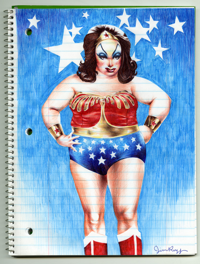
Can you believe he did this with Bics?
Supermag continues this “art-for-picture plane’s-sake” approach, but with modifications and additions. On the most basic level, Supermag is a collection of illustrations and comic stories by Rugg, some of which has appeared before. (I recognize at least a couple of the cartoony “USApe” strips—featuring a simian superhero battling real-life villains Osama Bin Laden and Kim Jong Il—from Geoff Grogan, Kevin Mutch and Alex Rader’s pood comics newspaper [2011].) Supermag is Rugg’s uptown version of a one-man anthology comic, a time machine to earlier days when Home Grown Funnies and Neat Stuff were available in head shops and/or comic book stores. Rugg and scripter Robin Bougie acknowledge Eightball in particular with “One Night in Paris,” a Supermag three-pager that evokes Dan Clowes’ “Like a Velvet Glove Cast in Iron” through stylish lettering, round inset panels, and disturbing sexual behavior inside a movie theater:

But nostalgia for old alt-comics is just one of the obsessions fueling Supermag; another is Rugg’s fixation on the cutie-pie stylization of old animated cartoons. A five page sequence in Supermag begins with a candy-colored double-page spread featuring “Cat and Mouse,” Rugg’s irreverent riff on Tom & Jerry / Itchy and Scratchy (it ends with Mouse consumed by a murder of crows), continues with “Chester Chipmunk in ‘Furreal” (Chester’s story also ends with a fatal crow attack), and concludes with a naturalistically-drawn single pager titled “Suburban Love Tales,” where drivers on a lonely country road are delayed by a Bambiesque deer wandering in front of their cars. I have no idea why Rugg staged this “Suburban” clash between cartoon and realistic representational modes, but it cracked me up.
Fans of the Rugg/Maruca collaboration will find much to love in Supermag, including pin-ups of Afrodisiac (one a Lego version of the badass hero in Rugg’s Bic style) and Street Angel, and stories featuring the pair’s other tongue-in-cheek characters (“Duke Armstrong, the World’s Mightiest Golfer,” “Captain Kidd, Explorer,” etc.). My favorite items in Supermag, though, are the luscious illustrations that open the comic, many of couples (Henry Rollins and Glenn Danzig!) in various states of intimacy. This cover for Foxing Quarterly, for instance, appears in a slightly modified form in Supermag (and is described by Rugg as “what it’s like working in a library. All day, every day”):

I loved Supermag. If my description of the comic makes it sound like a patchwork, a catch-all—well, that’s because it is. Readers who like comics primarily for their stories (whether they be the sprawling, never-ending narratives of continuity comics or the three-act structures of many graphic novels) might find the collage aesthetic of Supermag frustrating. Not me, though. I love its color, its audacity, its Mixmaster blending of graphic design styles; I love Rugg’s formidable craft chops and the way he hybridizes mainstream comics traditions with the Kramers emphasis on picture plane style. A lavish, joyously self-indulgent project like Supermag makes me a little more optimistic about contemporary comics culture, and I can’t wait to see what Rugg does next. As narrative collapses, art and love adopt the logic of dreams, and I don’t want to wake up.
Finally, a disclaimer: The images in this post were taken from a PDF of Supermag, Rugg’s Tumblr, and other Internet sites. Given Rugg’s extensive knowledge of and attention to the capacities of print and Internet images (see his blog post on the differences in color between the print and digital versions of Hellboy in Hell #1), I have every reason to believe that the production values on Supermag will be spectacular.


Craig–please write more and more and more. Thanks and I can’t wait to read Supermag!!!
I am so there! Rugg is a talent and this was a splendid article. I’ve always revered Kramers 4 and I find your analysis of its importance absolutely perfect. The brilliant wrap around cover says it all or should I say, shows it all.
You wrote: “The newfound emphasis on design and decoration… ”
Hmm…
I think back to the Image/Wildstorm roll out from a few decades back where page after page of storytelling was replaced with big splashes of”wallpaper” design. I realize the difference between then and now is a difference in artistic temperament (along with talent and focus) but I can’t help thinking those future zillionaires were doing the same thing but were limited by their personal vision.
But, boy, could ever be wrong or what?
You’re right about the Image comics, Andy. I never thought about them in that light, but from the few I’ve seen/read, your take seems completely accurate. (Maybe that’s why a few younger cartoonists of the post-KRAMERS generation are also starting to derive inspiration from Liefeld?)