HEROESCON :: GUEST SPOTLIGHT :: KHARY RANDOLPH
 Khary Randolph is an artist who isn’t easy to pin down. With sequential
  art, editorial illustration, toy design, and animation work on his resume, Randolph has shown the type of versatility needed to succeed in today’s marketplace as a commercial artist. With two books hitting shelves this week, Starborn #3 from BOOM and Charismagic #0 from Aspen, his work will be more visible than ever to comic fans. We recently had an opportunity to talk with this talented artist
 about his career and upcoming work.
Rico Renzi: Your work has appeared all over the place from animation to illustrations for ESPN the Magazine. Would you say you are a full-time comic artist right now?
Khary Randolph: For the first time in my career, yes I can say. All I’m doing is drawing comics right now, all day every day. It’s a pretty crazy time in my life.
RR: Are you working on Starborn and Charismagic simultaneously?

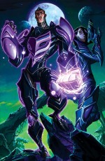 KR: Yeah, it’s pretty insane. I got both job offers within a week of each other, and both really appealed to me in very different ways so I was just like “eff it, let’s just see what happens.” I’m somehow pulling it off, just barely. It was tough at first, but I’m getting better at it with time, as I streamline my system, my style and my schedule. And of course lots of caffeine and lots of power naps help.
RR: So, you’re getting to scratch a different artistic itch with these two titles, what are the differences?
KR: Totally. Um, with Starborn it’s straight up high-fantasy, spaceopera sci-fi. It’s a really fun fast paced comic book and so the style I use on it is a little more open. There is very little shadow work in it. Mitch Gerard is the colorist on that book and his color totally matches the frenetic, kind of action-packed intensity of each issue. It feels very lighthearted, very pop art.
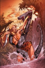 Charismagic however is fun but in a completely different way. It deals with magic and fantasy in a very moody, dark kind of way so I adjust my style to fit that. It’s a little more serious. The blacks and shadows are a lot heavier and Emilio Lopez’s colors, while colorful definitely have a heavier, moodier feel to them. It almost feels like Battle Chasers meets Hellboy.
KR: I think my natural inclinations lean towards fun, fast paced cartoony artwork. My fear is that I’ll get pigeonholed into that category and I’ll become “the cartoony guy that likes to draw hot chicks,” so the next project I do I’d like to maybe do something more serious, more grounded in reality just to show that I can do more than that. I want to go against my natural instincts and go darker, scarier, like Batman or maybe a horror book. Also, I tend to do line art very cleanly and I’d like to learn how to relax some and do a project with a looser line style, something maybe sketchier. What that is I have no idea however.
RR: What was your experience at last year’s HeroesCon like?
KR: Fantastic, it was one of my favorite con experiences of all time. The energy of that show was really inspiring and I loved the fact that the show really focused on the art of comics. The artists don’t feel like they’re relegated to the back of the convention hall like some sort of artistic ghetto, which has happened to me before. I can’t wait to do it again.
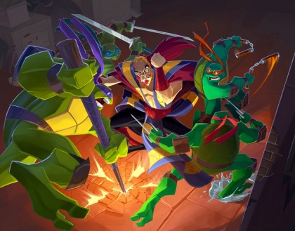
We can’t wait to have you back Khary! Thanks for taking time out of your busy schedule (two monthly books? cowabunga!!) to chat with us!








[…] This post was mentioned on Twitter by Aspen Comics, HEROESONLINE, Ron Salas, Khary Randolph, allisontype and others. allisontype said: RT @heroesonline: BLOG :: HEROESCON :: GUEST SPOTLIGHT :: KHARY RANDOLPH http://www.heroesonline.com/blog/2011/02/07/heroescon-guest-spo … […]
Nice. Look forward to meeting this fella. Love his style!
Another great interview, Rico.