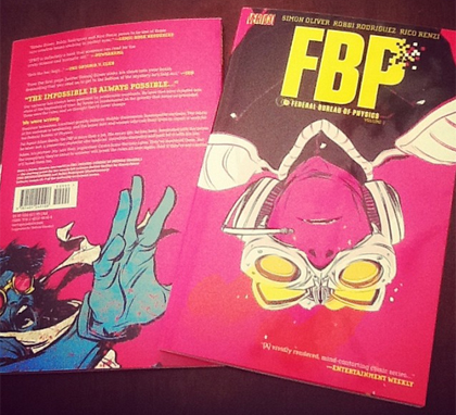
 SETH’S PICK :: COLLIDER #1: Many of you have heard that Vertigo is launching several new titles over the next few months. While this isn’t newsworthy in and of itself, what’s significant is that many of these new books bear little resemblance to the types of books Vertigo has produced in the past. Think less grim and gritty, and a little more colorful. Since it’s Vertigo, though, you can anticipate the same intelligent storytelling that you’ve come to expect. While Collider isn’t the first of these new series to hit shelves (100 Bullets: Brother Lono and American Vampire are already out), it’s certainly the most obvious indicator of the publisher’s new direction.
Simon Oliver‘s thoughtful script deals with a scenario in which the concrete laws of physics we’ve all lived under start going haywire. Reading the first issue, I could tell Oliver had done considerable research, but still wisely made it a character-driven story. Oliver’s heady ideas are bolstered by the remarkable work of artist Robbi Rodriguez. I’ve long been a fan of Robbi’s work, from Maintenance through his creator owned tour de force Frankie Get Your Gun. In the past, I’ve used cliches like ‘kinetic, dynamic, fluid’ to describe his work. Those words all still apply, but more than that, Collider reminded me of his strength as a storyteller. None of the panels are wasted, and even when the script calls for a fairly mundane scene (like that cabby at the end of the first issue), there’s life in them, and a moving forward of the story, even if just in the gradual change of a character’s expression.
The other half of the art team is Heroes’ own Rico Renzi. As with Loose Ends (his creator owned book with Jason Latour and Chris Brunner), here Rico reminds you how important coloring can be to a book. Like Loose Ends, Collider has its own defined palette, but one that is uniquely its own. Aside from looking unlike any other Vertigo book you’ve ever seen, the colors in Collider are executed in a way that makes sense in a story where the laws of physics are no longer what they were.
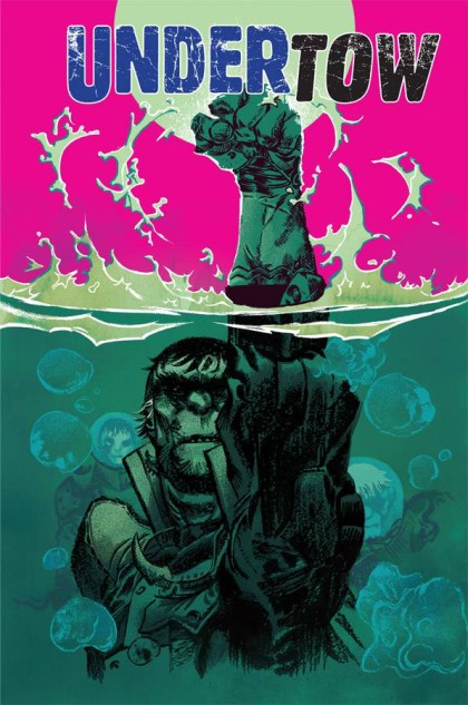
It would be a mistake if I didn’t also include a mention of Nathan Fox‘s cover art. It’s always frustrating when you see an incredible cover on a book where the interior art doesn’t remotely resemble it. Fox succeeds on Collider because he’s creating pieces that fall right in line with the art and colors of the book’s creative team. Not only does Fox maintain the aesthetic tone established by Rodriguez and Renzi, but he expounds on it. On the first issue’s cover, you get an image that seamlessly fits into the story. From script to art and colors to cover, Collider signifies how good comics can be when you have a creative team moving together in a unified, focused manner. If Collider represents the new Vertigo, we’ll all be enjoying some quality new comics over the next year. 












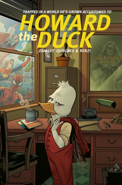
 JUSTIN’S PICK :: HOWARD THE DUCK #1: I’m a big fan of Howard. The guy’s on my business card, and indelibly inked onto me corporeally. Also, he’s in my heart and soul. A childhood love for that foul (see what I did there?) movie lead to a rekindled personal interest in the funnypapers. A lot of that had to do with the late, great Steve Gerber, the Duck’s creator and chronicler, and how his work provided a hitherto nonexistent intersection of comics and “comix”. Howard was the consummate outsider, but also a staunch everyman and rugged individualist. Personalities like that usually end up the most incisive of social critics. And that was Steve Gerber’s tack: Howard was his mouthpiece, his means of satirizing not only the insular culture of comics, but the pop culture abroad as well (even post Y2K, Gerbs was savaging his psychic surroundings…see Howard’s brilliant and underrated six issue MAX series if you don’t believe me). Howard WAS Gerber, and in other writers’ hands, well, he’s never been quite right.
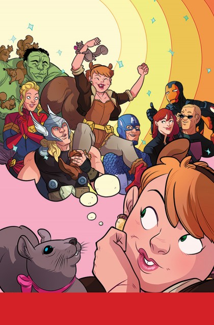
 HEATHER’S PICK :: UNBEATABLE SQUIRREL GIRL #1: Confession time, I had never heard of Squirrel Girl until a Free Comic Book Day a few years ago when a local cosplayer, Amberle, showed up in a most amazing costume. A bigger confession, until someone told me that she was a Marvel character, I thought Amberle just really loved squirrels. This week I will be able to start learning all about Doreen Green and her best squirrel friend, Tippy Toe. Doreen is leaving her secret apartment in the attic of Avengers Mansion (I seriously love that little detail and all of the fun things that are stored up there) and heading off to college to study computer science.
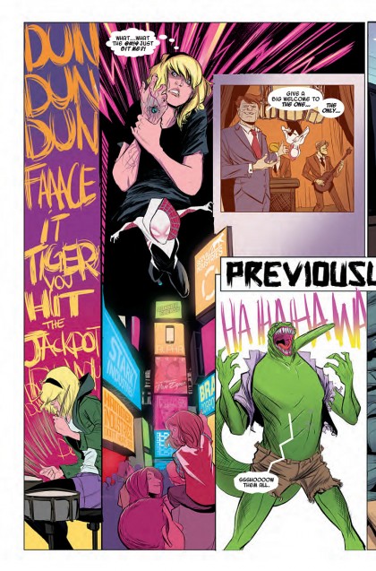
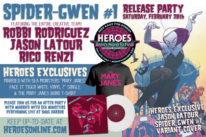
 SETH’S PICK :: EDGE OF SPIDER-VERSE #2: When was the last time any of you saw somebody cosplay as a character who hasn’t even appeared in a published comic? I didn’t think that was even possible until now. Over the past few months I’ve seen more and more pictures of cosplayers bringing Gwen Stacy: Spider-Woman to life. That character debuts in this week’s Edge of Spider-verse #2. So why have so many fans taken to this character so quickly?